| Our
Right Brain: The Red Russia Map
By Beth Donahue, Graphic
Designer
September 2007
I�ve been with Avalanche Press for
almost two years as graphic designer, and
have never seen a map like the playing board
for Red Russia.
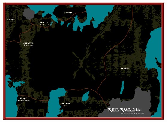
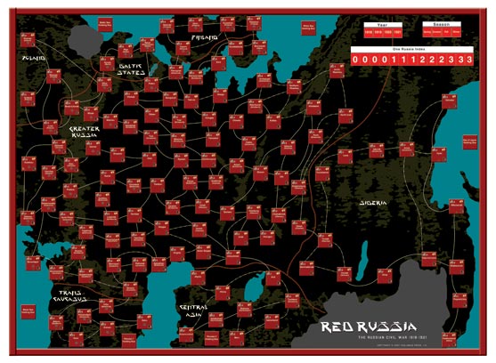
According to the game�s developer, Kevin
Canada, the map is unique from other Russian
Civil War titles because players can actually
campaign across every geographic region where
the Russian Civil War raged. The map is a
bit geographically askew because it is designed
to show the �spread� of Eurasia
from the edge of Russia in 1918 to the Sea
of Japan.
The game is played using individual �Areas�
instead of the map itself, which gives me
complete creativity over the background artwork.
Instead of leaving the earth green and the
ocean blue, I decided to give the water an
intense teal to offset black landmasses. I
also wanted to give the map an eclectic quality,
so I used a greenish-gray texture on the background.
Why black land? So that the game�s Areas,
which I made a deep garnet, would be highly
visible and jump off of the map. I wanted
them to be the most noticeable piece of the
map, considering you use them to play the
game.
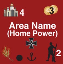
Red Russia�s map is covered
with approximately 125 land boxes called Areas.
Each Area represents a town or city important
to the struggle, either as a place of battle
(such as Saratov) or of political importance
(such as Moscow). Every Area contains the
following information: the name of the territory,
a Money value, a Garrison value, and a Manpower
value. Some Areas also contain special information
such as a port, a WWI German occupation line,
a rail center (used in the optional rail movement
rule) or a food production center (used with
the optional famine rule). I created graphics
to represent each Area�s specific information,
such as an anchor to represent a port or wheat
to represent a food production center.
William Sariego, the game's creator, designed
�transportation lines� to connect
the Areas. These lines actually represent
more than just movement between the Areas;
they symbolize the relative development of
the transportation infrastructure between
Areas, the geographic distance between Areas,
or the difficult terrain separating Areas.
According to Kevin, the single lines represent
Areas with good, easy terrain or some sort
of transportation infrastructure between them
(rail lines, roads, bridges, river barges,
etc.) that might facilitate movement. The
double-dash lines represent a limited terrain,
significant distance, or a lack of any major
transportation infrastructure serving to restrict
or otherwise limit movement by military forces.
The dotted-dashed lines are �trans-territory�
routes that represent very poor or limited
transportation infrastructure connecting the
major geographic regions of the former Russian
Empire or the vast distances covered by the
route. 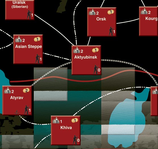
Transportation lines in Red Russia.
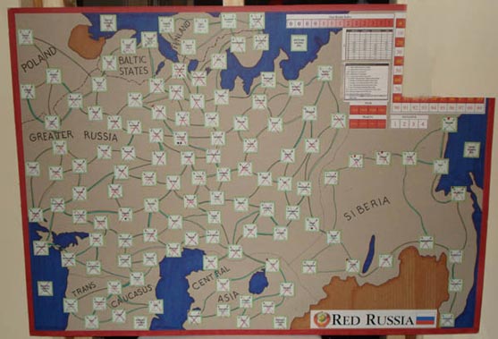
William Sariego created four separate sub-maps
depicting the major regions of fighting. Kevin
used those to develop a 35� x 25�
map making it easier to envision the entire
region. Using his computer, he designed the
landmasses and Areas, and then mocked up a
full-size map . . .
. . . which I then used to create
the final version.
Hope you enjoy!
Which
faction will sweep the many areas of Red Russia?
Order now and find out! |